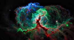
In Hubble-Palette imaging, you assign specific colors to emission lines from sulfur (SII), hydrogen (Hα), and oxygen (OIII) to create striking images of nebulae. Typically, SII appears reddish, Hα green, and OIII blue, highlighting different elements and structures. By carefully balancing these colors, you reveal intricate details and depth in the nebulae, making the images both beautiful and meaningful. If you keep exploring, you’ll discover how these color choices enhance both science and visual impact.
Key Takeaways
- In Hubble palette imaging, SII is assigned to red, Hα to green, and OIII to blue to highlight different nebula elements.
- The color assignment correlates with specific emission lines, revealing chemical composition and physical processes.
- Combining these narrowband images creates a false-color composite that emphasizes structural details.
- Adjustments to contrast, saturation, and gamma optimize the color balance for scientific accuracy and visual appeal.
- The process enhances features like filaments and shells, making nebulae more informative and aesthetically striking.

Hubble-Palette imaging is a specialized astrophotography technique that enhances the details and colors of deep-sky objects. When you immerse yourself in this method, you’re essentially assigning specific narrowband filters—namely SII, Hα, and OIII—to different colors in your image. This process, known as color mapping, allows you to create visually striking images that reveal the intricate structure and composition of nebulae. Your goal is to translate the raw data into a color scheme that highlights the physical processes occurring within these celestial objects.
Hubble-Palette imaging uses specific filters to reveal nebulae’s intricate structures and colors.
The key to successful Hubble-Palette imaging lies in meticulous image processing. After capturing your narrowband images through specialized filters, you’ll combine them using software tailored for astrophotography. During this stage, you assign the SII filter data to red, Hα to green, and OIII to blue, following the traditional Hubble palette. This color assignment isn’t arbitrary; it’s based on the emission lines of ionized gases present in nebulae. By carefully balancing these channels, you create a harmonious image that emphasizes areas rich in specific elements, such as sulfur, hydrogen, and oxygen.
Your task in image processing is to fine-tune the composite image. You might adjust contrast, saturation, or gamma levels to bring out subtle details without overdoing it. Effective color mapping ensures that each element’s contribution stands out, providing a realistic yet vibrant representation of the nebula’s complex chemistry. You also need to remove noise, correct for any optical distortions, and sometimes blend additional data to enhance clarity. This process transforms raw data into a compelling visual narrative, allowing viewers to appreciate the structure and composition of the deep-sky object. Additionally, understanding the health benefits of clear and accurate imaging can help astrophotographers maintain their equipment and optimize their results.
As you work through the image processing, remember that the choice of color mapping directly influences how viewers interpret the image. A well-executed Hubble palette can make a nebula appear more three-dimensional, revealing filaments, knots, and shells that are otherwise hidden. It’s essential to maintain a balance—highlighting essential details while avoiding artificial or exaggerated colors. The subtle interplay of hues adds depth and realism, making your astrophotography not just scientifically informative but also aesthetically captivating.

SVBONY SV220 Telescope Filter, 2" 7nm Dual-Band Nebula Filter, Reduce Stray Light, H-Alpha&O-III Narrowband Filter for One-Shot Color Camera, Telescope Accessories for Deep Sky Astrophotography
Capture Purer Nebula Light: SV220 2" Dual-Band Filter allows high transmission of OIII (500.7nm) and H-Alpha (656.3nm) nebula…
As an affiliate, we earn on qualifying purchases.
As an affiliate, we earn on qualifying purchases.
Frequently Asked Questions
How Do Different Filter Combinations Affect Hubble-Palette Images?
Different filter combinations considerably influence the color influence in your Hubble-Palette images. Using more SII filters emphasizes red hues, while adding Hα enhances warm tones. Incorporating OIII filters boosts blue and teal shades. By adjusting your filter combination, you control the overall color balance, making your images more vivid or subtle. Experiment with different setups to see how each filter combination impacts the final color influence, creating stunning and personalized astrophotography.
What Are the Best Tools for Processing Hubble-Palette Data?
Think of your processing workflow as a symphony, where each software tool plays a crucial role. For Hubble-palette data, Adobe Photoshop and PixInsight are top choices, offering advanced layering, masking, and color calibration. These tools help you refine your images with precision. Combining them ensures your data’s true beauty shines through, transforming raw data into stunning cosmic art with clarity and depth.
Can Hubble-Palette Imaging Be Applied to Amateur Astrophotography?
Yes, you can apply Hubble-Palette imaging to amateur astrophotography. Start by ensuring your filters are well calibrated, which improves color accuracy. Use image stacking to enhance signal-to-noise ratio and detail. Once you have your calibrated images, assign SII, Hα, and OIII data to red, green, and blue channels respectively. This process allows you to create stunning, scientifically meaningful images similar to professional Hubble images.
How Does the Choice of Color Mapping Influence Scientific Interpretation?
Think of color mapping as painting with scientific brushes—your choices shape how others see and interpret your data. By selecting specific colors, you influence color perception and highlight certain features, but it can also distort data accuracy. You control the story your image tells; choose wisely to make sure your scientific message remains clear and truthful, rather than clouded by artistic bias.
Are There Common Pitfalls When Assigning SII, Hα, and OIII Colors?
When assigning SII, Hα, and OIII colors, you should watch out for common pitfalls like poor color balance and artifact introduction. Overemphasizing one color can skew scientific interpretation, making features appear misleading. To prevent this, carefully adjust the color balance for a natural look and check for artifacts such as halos or false color gradients. This ensures your image remains both accurate and visually appealing.

PixInsight User Guide for Beginners: A Step-by-Step Manual for Astrophotography Processing, Troubleshooting & Creative Workflows
As an affiliate, we earn on qualifying purchases.
As an affiliate, we earn on qualifying purchases.
Conclusion
You now see how the Hubble Palette brings nebulae to life, blending SII, Hα, and OIII colors in a stunning dance. It’s fascinating how assigning these hues reveals intricate details, connecting your eye to the universe’s beauty. As you explore further, you realize that these color choices aren’t just artistic—they’re a window into cosmic chemistry. In this way, the palette transforms your view, making the universe’s hidden stories more vivid and alive.

Astromania 1.25-Inch Specialized Planetary Imaging Filter Set – 3-Piece (UV/Methane/IR) for Enhanced Astrophotos
This set of three imaging filters includes the most vital filters for optimizing monochrome planetary portraits; includes an…
As an affiliate, we earn on qualifying purchases.
As an affiliate, we earn on qualifying purchases.

SVBONY SV405CC Cooled Telescope Camera, 11.7 MP USB3.0, BI IMX294 CMOS Color Sensor, Astrophotography Camera with AR Coating, Astronomy Electronic Eyepiece for Deep Sky Astrophotography&Lucky Imaging
High-Sensitivity 4/3" Sensor: Back-illuminated IMX294 with 4.63μm pixels (4144×2822) for excellent light capture. The 63ke- full well capacity…
As an affiliate, we earn on qualifying purchases.
As an affiliate, we earn on qualifying purchases.