
Color mapping in narrowband imaging involves assigning specific colors to signals captured through filters like H-alpha, Oxygen III, and Sulfur II, transforming monochrome data into vibrant, informative images. It enhances celestial features by highlighting details, guiding your eye, and adding artistic impact. Understanding how to choose palettes, avoid common mistakes, and use software tools will improve your results. Continue exploring to uncover more tips and techniques for creating stunning astrophotography images.
Key Takeaways
- Color mapping translates narrowband filter data into visual images, highlighting celestial features through assigned hues.
- Common filters like H-alpha, Oxygen III, and Sulfur II isolate specific emission lines for detailed imaging.
- Effective color assignment uses principles like harmony, contrast, and spectral analysis to enhance interpretability and aesthetics.
- Proper software tools enable precise control over hue, saturation, and contrast for optimal visual results.
- Avoiding common pitfalls such as incorrect hues and low contrast ensures accurate and visually appealing astrophotography images.

SVBONY SV227 2" SHO Telescope Filter Set, Narrowband Filter Kit, SII H-Alpha OIII 5nm Narrow-Band Filters, Reduce Light Pollution, 3Pcs Set for Emission Nebula Planetary Nebulae Astrophotography
SV227 2" Narrow-Band Filter is specifically designed for use with monochrome cameras in astrophotography; it effectively isolates the…
As an affiliate, we earn on qualifying purchases.
As an affiliate, we earn on qualifying purchases.
What Is Color Mapping in Narrowband Imaging?

Have you ever wondered how astronomers translate the faint signals from narrowband filters into striking images? It all comes down to color mapping, a technique rooted in color theory and visual perception. When capturing narrowband images, astronomers assign specific colors to different wavelengths, creating a visual language that reveals celestial details. This process involves understanding how our eyes perceive color and how various hues influence our interpretation of the image. By carefully selecting colors for each signal, astronomers enhance contrast and highlight features that might otherwise go unnoticed. Fundamentally, color mapping transforms raw data into vivid, informative visuals, allowing you to see the universe through a new lens. It’s a blend of science and art, driven by an understanding of how humans perceive color. Color perception plays a crucial role in ensuring that the images convey meaningful information effectively.

DGK Color Tools Digital Kolor Pro 16:9 Large Color Calibration and Video Chip Chart, 2-Pack
SUPERIOR ACCURACY – Ensures precise color calibration with professional-grade chips, delivering consistent and reliable results for video production.
As an affiliate, we earn on qualifying purchases.
As an affiliate, we earn on qualifying purchases.
The Importance of Color in Astrophotography
Color plays a crucial role in astrophotography because it guides your eye and helps you interpret celestial features more effectively. Your perception of color enhances the depth and detail of images, making faint structures stand out. Using color thoughtfully allows you to express artistic vision and bring your images to life. Consider these aspects:
Color enhances astrophotography by revealing details, guiding the eye, and expressing artistic vision.
- Color perception influences how you distinguish between different nebulae and star types.
- Artistic expression enables you to craft images with mood, contrast, and emphasis.
- Color mapping helps you interpret data more accurately by assigning meaningful hues to specific celestial features.
- Incorporating an understanding of spiritual symbolism can deepen your appreciation of the celestial objects you capture, adding a layer of personal or cultural significance to your images.

Celestron 93623 Narrowband Oxygen III 1.25" Filter – Isolates Oxygen Lines Emitted by Planetary and Emission Nebulae, Eliminates Un-Natural Coloured Halos Surrounding Bright Stars, Black
The 1-1/4" OIII narrowband filter isolates just the two doubly-ionized oxygen lines (496 and 501nm lines) emitted by…
As an affiliate, we earn on qualifying purchases.
As an affiliate, we earn on qualifying purchases.
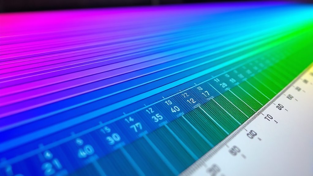
Common Narrowband Filters and Their Wavelengths
Narrowband filters are essential tools in astrophotography because they isolate specific wavelengths of light emitted by celestial objects, allowing you to capture detailed images even through light pollution. These filters target particular emission lines, making it easier to apply color theory for accurate representations. Common filters include H-alpha, Oxygen III, and Sulfur II, each corresponding to distinct wavelengths:
| Filter Type | Wavelength (nm) | Typical Use |
|---|---|---|
| H-alpha | 656.3 | Emission nebulae, hydrogen lines |
| Oxygen III | 500.7 | Planetary nebulae, supernova remnants |
| Sulfur II | 672.4 | Dark nebulae, supernova remnants |
Understanding these wavelengths helps with wavelength calibration, ensuring your color map reflects true emissions. Recognizing the specific wavelengths allows you to craft visually appealing images rooted in accurate color science. Accurate wavelength calibration is crucial for producing scientifically meaningful images and achieving precise color mapping.

Magic Palette Color Mixing Guide 11.5 Inch
Please__contact us to solve the problem w/ name: The Color Wheel 5324CW Magic Palette Personal Mixing Guide New…
As an affiliate, we earn on qualifying purchases.
As an affiliate, we earn on qualifying purchases.
Basic Principles of Assigning Colors to Data
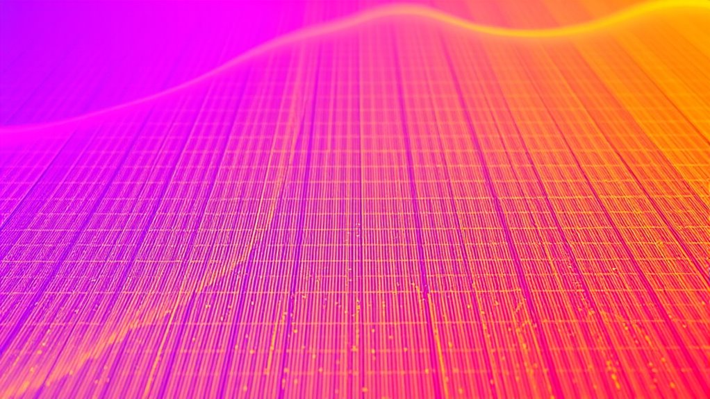
Assigning colors to data involves translating specific wavelengths of light into visual cues that are both meaningful and aesthetically pleasing. To do this effectively, you should consider three key principles:
Effective data coloring translates wavelengths into meaningful, aesthetic cues by applying color psychology, historical theories, and consistent gradients.
- Leverage color psychology to evoke desired emotional responses, such as using red for urgency or blue for calm.
- Understand historical color theories, like the color wheel, to create harmonious color relationships.
- Maintain consistency by mapping data ranges to intuitive color gradients, helping viewers interpret information quickly.
Choosing a Color Palette for Your Images

When choosing a color palette, you should consider color harmony principles to create visually pleasing images. Keep palette consistency in mind to make certain your colors work well together across the entire project. Additionally, think about the mood and tone you want to convey, as colors can greatly impact the viewer’s emotional response. Incorporating organization techniques can help maintain a cohesive and balanced color scheme throughout your work.
Color Harmony Principles
Choosing a color palette that harmonizes well can substantially enhance the visual impact of your images. To do this effectively, apply principles from color theory and spectral analysis. First, understand how complementary colors create contrast and balance. Second, explore analogous color schemes for a harmonious, unified look. Third, consider triadic palettes for vibrant, dynamic compositions. By analyzing spectral data, you can identify the precise wavelengths that produce desired hues, ensuring your palette aligns with natural or artificial lighting conditions. This scientific approach enhances your ability to evoke specific moods or emphasize features. Additionally, understanding how color accuracy impacts overall image quality allows for more precise adjustments during editing. Mastering these color harmony principles helps you craft visually appealing images that draw viewers in and communicate your intended message more powerfully.
Palette Consistency Tips
Building on your understanding of color harmony principles, maintaining palette consistency across your images guarantees a cohesive and professional look. When selecting a palette, focus on a limited color set to ensure color consistency. A well-chosen palette simplifies your workflow and creates visual harmony. To help guide your palette selection, consider this example:
| Primary Colors | Accent Colors | Neutral Colors |
|---|---|---|
| Deep Blue | Bright Orange | Soft Gray |
| Forest Green | Warm Red | Off-White |
| Purple | Gold | Charcoal |
Stick to these core colors, and avoid adding too many variations. Consistent palette selection ensures your images look unified and polished, making your project stand out. For optimal results, reviewing color support hours can help you plan your design timeline effectively.
Mood and Tone Selection
Selecting the right color palette sets the emotional tone and guides the viewer’s perception of your images. To achieve this, focus on how colors evoke emotional resonance through color symbolism. Consider these steps:
- Identify the mood you want to convey—calm, excitement, or mystery—and choose colors that align with that feeling.
- Use color symbolism to reinforce your message; for example, blue suggests tranquility, while red indicates passion or urgency.
- Balance your palette to ensure consistency, allowing the emotional tone to remain clear and impactful without overwhelming the viewer.
- Remember that understanding the emotional impact of colors can help you craft images that resonate more deeply with your audience.
How to Create a Color Map Step-by-Step

Creating a color map involves translating data values into specific colors to visualize information effectively. Start by analyzing your spectral data through spectral analysis to identify key features. Next, choose the right filter for your narrowband imaging, which impacts how data is captured and interpreted. Then, assign colors to data ranges based on intensity or wavelength, ensuring they reflect the spectral characteristics accurately. Use software like Photoshop or dedicated astrophotography tools to apply your color scheme. Keep your choices consistent throughout your project for clarity. Here’s a quick overview:
| Step | Action |
|---|---|
| 1 | Analyze spectral data |
| 2 | Select appropriate filters |
| 3 | Map data values to specific colors |
– To enhance your understanding, consider how filter selection influences the accuracy of your spectral analysis and the resulting color map.
Tips for Enhancing Image Detail With Color Mapping

To make your images stand out, try adjusting the color contrast to highlight subtle details. Applying custom color palettes can also bring out specific features and create a more striking visual effect. These simple tweaks can considerably improve the overall clarity and impact of your narrowband images. Additionally, utilizing visual enhancement techniques can further optimize your image quality and detail perception.
Adjusting Color Contrast
Adjusting color contrast is a essential step in enhancing the detail and depth of your narrowband images. It helps emphasize spectral contrast, making features pop and adding visual clarity. To optimize your image:
- Use hue adjustment to fine-tune color relationships, increasing the separation between spectral features.
- Adjust saturation levels to prevent colors from becoming oversaturated or washed out.
- Fine-tune brightness and contrast to highlight subtle details without losing natural balance.
- Incorporating proper storage techniques can help preserve the vibrancy and clarity of your images over time.
Applying Custom Color Palettes
Applying custom color palettes allows you to tailor the visual representation of your narrowband images, highlighting specific features and details that standard mappings might miss. One effective technique is spectral blending, which combines different emission lines to create unique color effects, emphasizing structures otherwise overlooked. You can also use hue rotation to shift colors within your palette, revealing subtle contrasts and enhancing overall detail. By experimenting with custom palettes, you gain greater control over how your image communicates information, making faint or complex features more apparent. These adjustments help you craft visuals that are both scientifically informative and visually striking, allowing you to better interpret the data and share your results more effectively.
Common Mistakes to Avoid When Color Mapping

When color mapping in narrowband imaging goes wrong, it can lead to misleading or confusing results that undermine your analysis. One common mistake is incorrect hue selection, which can distort the true features of your image. Another pitfall is neglecting color contrast, making different regions hard to distinguish and reducing overall clarity. To avoid these issues, keep these points in mind:
- Choose hues that accurately reflect your data’s intensity variations.
- Ensure sufficient contrast between mapped colors to highlight key details.
- Test different color schemes to see which best represents your features without bias.
Software Tools for Color Mapping in Narrowband Imaging

Choosing the right software tools is essential for effective color mapping in narrowband imaging. You need software with strong compatibility across your equipment and data formats to streamline your workflow. Look for programs that support precise color calibration, ensuring your images reflect accurate hues and intensities. Many popular tools offer customizable color palettes and advanced layering options, giving you control over how narrowband signals are translated into visible colors. Compatibility with your camera, filters, and processing hardware is vital to avoid technical issues. Additionally, user-friendly interfaces help beginners navigate complex adjustments. By selecting software optimized for narrowband imaging, you’ll enhance your ability to create compelling, scientifically accurate color maps with ease and confidence.
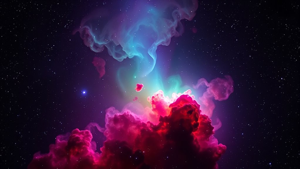
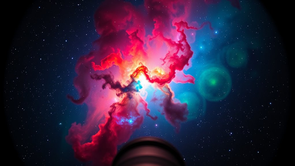
Practical Examples of Effective Color Mappings

Effective color mappings bring narrowband images to life by highlighting key features and structures. By applying principles of color theory, you can craft visuals that tell compelling stories. For example, you might assign red to hydrogen alpha emissions, enhancing regions of star formation, or use green for oxygen lines to emphasize ionized gas. To improve visual storytelling, consider these approaches:
- Use contrasting colors to differentiate overlapping structures clearly.
- Limit color palettes to prevent confusion and maintain focus on main features.
- Apply color gradients to convey depth or intensity variations across the image.
These techniques help viewers interpret complex data intuitively, making your images more engaging and informative. Effective color mapping not only enhances clarity but also guides viewers through your narrative, emphasizing the story your narrowband image communicates.
Frequently Asked Questions
How Does Atmospheric Interference Affect Color Mapping Accuracy?
Atmospheric interference can considerably impact color mapping accuracy by introducing noise from light pollution and reducing sensor sensitivity. When light pollution is present, it skews the true colors captured, making it harder to distinguish subtle differences. Additionally, atmospheric particles weaken sensor sensitivity, causing less precise readings. As a result, your color mapping becomes less reliable, and you may need to apply corrections or choose ideal times and conditions for clearer, more accurate results.
Can Color Mapping Be Automated for Batch Processing?
Yes, you can automate color mapping for batch processing using automated algorithms. These algorithms streamline the process, allowing you to apply consistent color schemes across multiple images quickly and efficiently. By setting up predefined parameters and workflows, you minimize manual effort, reduce errors, and guarantee uniformity. Automation makes large-scale projects manageable, saves time, and enhances productivity, so you can focus on analysis and interpretation rather than repetitive tasks.
What Are the Best Practices for Color Calibration in Narrowband Imaging?
You should start with proper color calibration by using standard reference images or calibration targets to guarantee color accuracy. During image processing, adjust your narrowband filters and camera settings consistently. Regularly verify your calibration with known star fields or calibration sources, and keep detailed records of your adjustments. This approach helps maintain consistent, accurate color mapping, leading to high-quality narrowband images that truly reflect the celestial objects you’re capturing.
How Do Different Star Types Influence Color Mapping Choices?
Different star types influence your color mapping choices because their star spectral and color temperature vary considerably. Hot blue stars have higher temperatures and emit more blue light, so you’ll want to emphasize blue hues in your map. Cooler red stars emit more red light, guiding you to highlight red tones. Adjust your color mapping to match these spectral and temperature differences, ensuring your image accurately reflects the star’s true colors for a visually appealing result.
Is There a Standard Color Palette Recommended for Astrophotography?
Think of your astrophotography as painting a cosmic masterpiece. While there’s no strict standard palette, many artists choose harmonious colors like deep blues and vibrant reds for balance, emphasizing color harmony. To make celestial objects pop, use contrasting hues that draw the eye, creating visual interest. Experiment with these principles, and you’ll craft images that are both scientifically accurate and artistically stunning, capturing the universe’s true beauty.
Conclusion
By understanding color mapping, you open the potential of your narrowband images. By choosing the right colors, you enhance detail; by avoiding common mistakes, you guarantee clarity; by exploring tools and techniques, you elevate your astrophotography. Embrace experimentation, learn from each image, and refine your approach. Because in color mapping, as in astrophotography, clarity comes from curiosity, beauty comes from balance, and your passion transforms data into stunning visuals.